Distressed Property Analysis Platform (MVP)
Designed the end-to-end UX/UI for an MVP platform for distressed real estate investments in the US market. Usability testing before launch validated key features and led to an 8% increase in pricing page conversion. 🔒 Due to an NDA, some branding, visuals, and product details have been modified or omitted.
Industry
Investment Tech (B2C)
Role
Product Designer

THE PROBLEM
Investors in the foreclosure and distressed real estate market rely on multiple platforms to check a single property, making the process slow and confusing. The goal was an MVP that puts all key data in one place.
RESEARCH
We worked as a small team and focused on speed and clarity, starting with competitor analysis that revealed a gap between transaction platforms (low analytics) and marketplaces (limited distressed insights).
⭐ Key insight: No platform has combined all critical real estate data into a single interface.

USER PAIN POINTS
Market analysis showed that foreclosure investors face data fragmentation, needing to switch between multiple platforms to evaluate a single property — causing delays and overload.
No single place provides a full property overview, making analysis difficult.
Limited access to owner contact requires third-party tools and slows decisions.

Outcomes
Defined the opportunity for an all-in-one distressed property intelligence platform
Highlighted the lack of structured property data
Identified integrated Skip Tracing as a strong competitive differentiator.
DESIGN SOLUTIONS
Based on the research, I focused the MVP design on four core goals:
Public & Pro structure — basic browsing for all, full data unlocked in Pro.
Fast property discovery — quick search and access to key property data.
Clear architecture — complex data simplified into a structured dashboard.
Trust & clarity — organized data for confident decisions.
Key Page Prototyping
Wireframed the Homepage, Search, and Property pages as the base for the first iteration, focusing on clear hierarchy and quick scanning of key investment data.

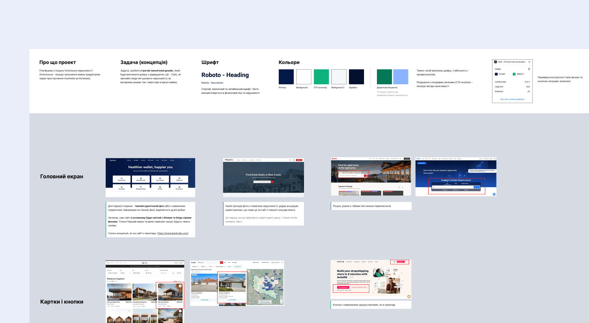
Color System and the Moodboard
A neutral palette creates a professional, trustworthy feel, with accent color reserved for CTAs and status labels.
Structured Listings: Search, Filters & Statuses
The listing page follows a familiar marketplace layout — search and filters on top, property grid below — with filters (location, type, price, status) and status badges helping investors scan faster.


Structuring Complex Legal & Financial Data
Property pages use tables, charts, and accordions to structure complex legal and financial data, reducing clutter and improving readability.


PROTOTYPING & VALIDATION
Replacing Charts with Tables
Charts for price trends and listing history were removed — they added complexity without enough value for an MVP — and replaced with tables for easier scanning and comparison. 🚀 Impact: faster listing comparison and decision-making.

Map & Street View on the Property Page
Users previously left the platform to check maps or Street View, causing drop-offs. Adding an in-page map and Street View let them explore properties without leaving. 🚀 Impact: Session time +12%, engagement +10%.

Pricing Page Optimization
Pricing page conversion was initially low, signaling unclear value. Testing new layouts and adding clearer features, FAQ, and payment options improved performance. 🚀 Impact: conversion +8%.

FINAL DESIGN
The final product version combined structured data presentation, familiar search patterns, and improved visual hierarchy.
The interface includes:
a clear filtering system with property status badges
more prominent CTAs to guide key user actions,
integrated Map and Street View for evaluating locations without leaving the platform,
an optimized Pricing Page that communicates value more clearly.


