Radio & podcast streaming app and website
Redesigned the mobile app and website of an Israeli radio and podcast platform. The app moved to a modern Material 3 system covering radio, podcasts, and discovery. The website update lifted in-browser player engagement by ~7% and A/B-tested app download conversion by ~4% (post-launch metrics shared by the client). Note: The website shipped first as the urgent task. The app redesign is still rolling out, so app-side results aren't measured yet.
Industry
Media & Streaming
Role
UX/UI designer

THE PROBLEM
The app and website were both built in 2018 and hadn't changed since — the app looked dated, kept radio and podcasts in separate places, and had no way to help people find something to listen to. The client wanted a modern app bringing all three together, plus a quick website fix to raise downloads and listening time, with the website shipped first as the urgent task.
RESEARCH
I audited the existing app, compared it with TuneIn, iHeartRadio, Radio Garden, and Pocket Casts, and used Google, WhatsApp, and Truecaller as Material 3 references for the visual refresh.
⭐ Key insight: loyal listeners were staying, but outdated UI and weak content discovery limited engagement and future growth.

USER PAIN POINTS
The app felt old, and the website's dated look with a weak download prompt was holding back both installs and engagement.
The app split radio from podcasts, with no path between them and no recommendations, collections, or in-app help to find something new
The website looked outdated and had an easy-to-miss download CTA, keeping installs and session time low
Outcomes
Identified an outdated interface that weakened trust and lowered app download conversion
Found short sessions and a fragmented experience — radio and podcasts lived in separate places
Defined missing discovery features — no recommendations, curated collections, or in-app AI chat
DESIGN SOLUTIONS
I focused the app on one consistent system and on discovery, and kept the website changes tight and high-impact:
Mobile app on Material 3 — one token-based system with light and dark themes
Podcasts, recommendations & AI chat — radio and podcasts in one app, plus discovery
In-browser player redesign — easier to switch and explore stations
App download CTA — clearer, harder-to-miss header prompt
Mobile App on Material 3
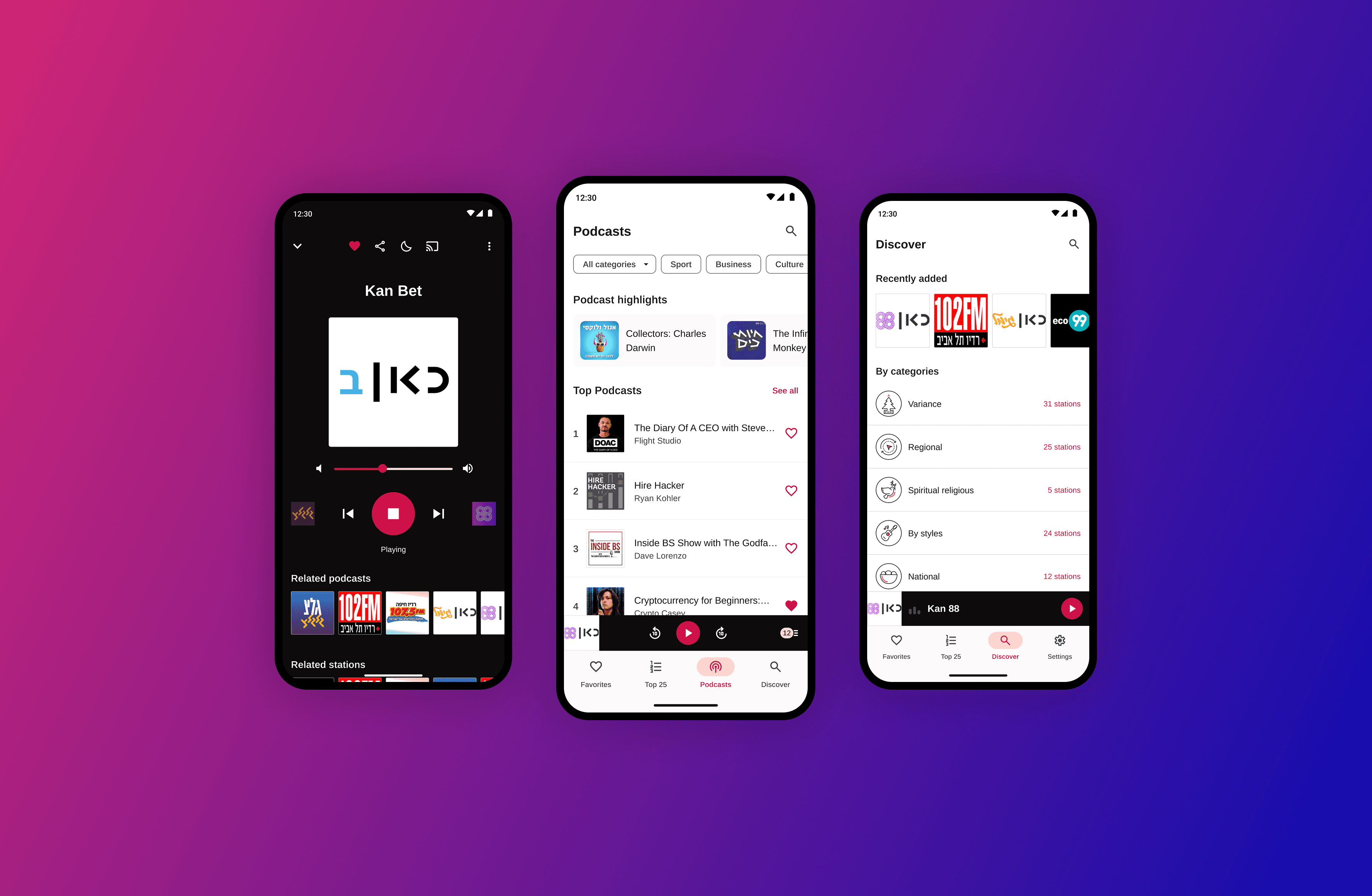
I rebuilt the app on Material 3 with a single set of tokens and light/dark themes, replacing the 2018 look and making the core screens consistent and easy to extend.
Podcasts, Recommendations & AI Chat
I brought podcasts into the same app as radio and added curated collections, recommendations, and an in-app AI chat, so finding something to listen to no longer meant leaving the app.

In-Browser Player
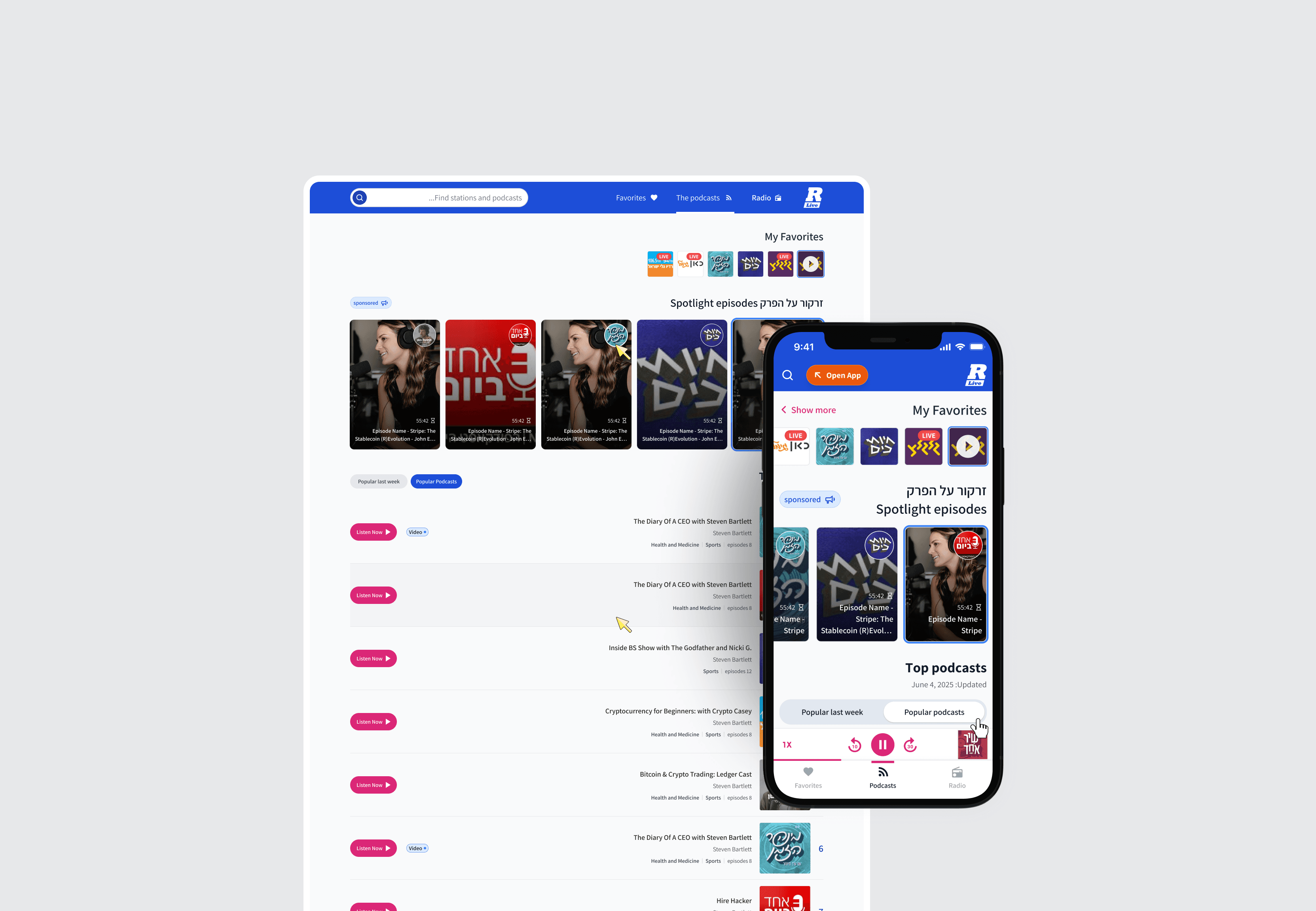
On the website, I redesigned the player so starting, switching, and browsing stations is easier — turning it from a dead end into a starting point for exploration.

App Download CTA
I reworked the header CTA to be visible and clear about what you get, A/B testing it against the old version before rolling it out.
PROTOTYPING & VALIDATION
Usability Testing with Real Users
I tested the new app flows with real users to see whether people could move between radio and podcasts and use discovery without getting lost, then adjusted the navigation based on where they got stuck.
A/B Testing the Download CTA
The header CTA went through A/B testing on the live site. The new version won, which is where the ~4% download conversion lift came from.

RTL & Shipping the Website First
Since the site is Hebrew and fully RTL, I checked the player and CTA held up mirrored, then shipped the website first as the urgent task while the app kept moving through testing. 🚀 Results: ~7% player engagement • ~4% download conversion (based on post-launch metrics shared by the client)

FINAL DESIGN
The app now runs on one modern system covering radio, podcasts, and discovery, and the website changes are live and measured.
The work includes:
full app redesign on Material 3 with light and dark themes
podcast, recommendation, and AI chat screens
redesigned in-browser player
optimized, A/B-tested download CTA


